Rethinking the Business Page
Role: Lead product designer Team: 2 product designers, 1 product manager, 4 engineers (web), 6 Engineers (Mobible)
In 2018, the consumer team's product & design year-long initiative was to help users 'live a better day', focused on delivering more value to users with our consumer product as part of Yelp's mission of connecting people to great local businesses. To this end, I worked with my team to re-think Yelp's business page.

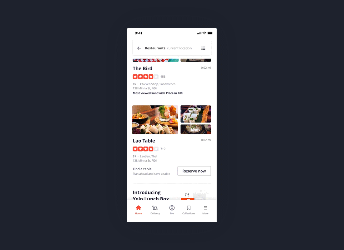
2 screens from final deliverables
Motivations & understanding the problem space
The business page is where Yelp users eventually end up, the tail end of every main use-case, but also beginning of many key flows. When I began working at Yelp, web features were lagging behind mobile. The design was a mish-mash of features added on, hierarchy was lacking, and the UI was in need of an update. There were a number of product issues as well; web hadn’t been designed holistically as various teams “own” parts of the experience; pages behaved differently and showcased disparate designs across platforms; listings that had little to no information were not optimized to ask users for reviews or contributions. Across Yelp’s many, many categories - Dining, Services, Wellness, etc - business pages varied drastically in type & quantity of info.

Yelp’s business page before the re-design - poor hierarchy of info, unclear primary action, overwhelming UI
Finding areas of impact
To ensure we were tackling the most impactful opportunities, we started by gathering research insights. Leveraging Yelp's internal research & data as well as help from our research team, we found 4 areas that needed to be addressed:
Users were not finding the main action(s) on the business listing
Users on restaurant & dining categories, Yelp’s bread and butter, have different behaviors than users on other categories, and thus need different types of information displayed, and potentially layouts that support more use cases
Negative sentiment - users score high on usefulness, but lower on trust, and much lower on delight
Improve usability — focus on finding valuable info fast & consistent experiences across platforms

We conducted several card sort studies with 4 different user groups to understand which pieces of information were most important
Explorations & layout
We began by narrowing focus to the majority use cases on Yelp’s well-known categories in dining & restaurants for web & mobile. Based on our research and goals, we decided on a photo-first layout

We anchored on the most important pieces for the Restaurants use cases - rating & photos
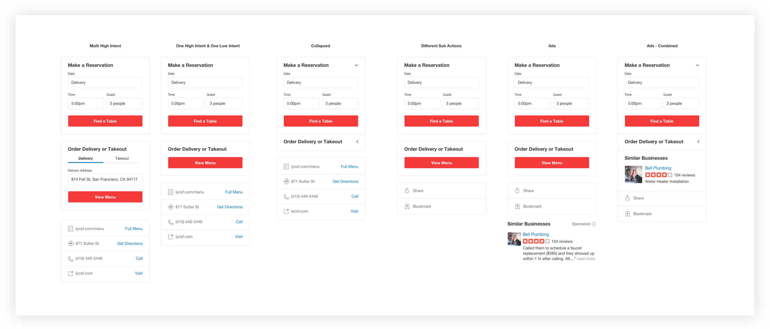
Systemizing components & designing for scale
To undertake such a huge project with both UX & visual changes, our team created a mini-styleguide with usage & components specifically for the project, which later became the model from which a newer design system was built.
Other Considerations
Worked with the business owner team to align the product directions from consumer to business. We worked on making sure product flows & consumer learnings were communicated to business owners as they build their pages
Final designs
6 months of numerous workshops, iterations, critiques, and reviews resulted in finalized web, iOS, and Android final deliverables that tackled UI/UX as well as system challenges

Snippet of final web deliverables

Snippets of final Mobile designs

Before & Afters on both Restaurants business page (left) and Home Services page (right)
Learnings & Impact
Though changes & testing for mobile is ongoing, the re-design of the web resulted in improved usability and a 28% increase to CTR, with 1.5% increase to conversion on primary actions. Key takeways:
Early sharing with key stakeholders is sometimes a great way to speed up a large, cross-team project that touches many components and key flows.
Partnering with PMs and engineers throughout the project really bonded the team and paved the way for the success of the project over a long period of time. The team became experts in the understanding of the pixels, code, and business strategy behind a very important destination at Yelp.
Without a robust design system, building a beautiful, coherent experience is tough. Many projects fail to reach its full production potential due to constraints on the Yelp design system. Though investments in engineering & design tools take time, they are ultimately necessary for sustainable & effective product-building.